
Great Pet Account
FULL WEBSITE REDESIGN
Great Pet Care
2022/2023, Product Design

Problem
Our challenge was to revamp an existing pet manager platform that, despite being established, struggled with low user engagement. Without substantial user data to guide us, a heuristic analysis revealed issues in the information architecture—leading to confusion and an impersonal user experience. The lack of clarity in information priority compounded the problem.
Goal
Our objective was to reimagine the information architecture, ensuring the inclusion of all features without overwhelming users with an excess of data. Striking a balance was crucial to prevent users from feeling lost or inundated.
Result
Our efforts yielded positive outcomes. In the initial email campaign targeting pet owners, we not only met but exceeded expectations by generating an additional $10k in revenue. This success underscored the effectiveness of our redesigned platform in engaging users and delivering tangible results.
MY ROLE
Study
Research / Competitors Analyzes
UX
Design System / Information Architecture/ Site Map / Wireframe / Research
UI
Style
SOFTWARES


KPIs
What we thought
What we got
Open rate
CTR
Profiles created
Transactions
GPM Revenue
35%
2%
200
2
$240
56%
1.75%
3,700+
80
$11,076
"AS A PET OWNER, I WANT AN APP THAT HELPS ME ORGANIZE ALL ASPECTS OF THE PET'S LIFE SO THAT I HAVE EVERYTHING IN THE SAME PLACE."
"AS A VETERINARIAN, I WANT AN EASY WAY TO SEND RECORDS SO THAT I CAN OFFER THIS NEW OPTION TO CLIENTS."
WHY THE PROBLEM?
Information Architecture
Previous information archives posed challenges with limited functionality—pages couldn't be added within main pages, and the interface felt cluttered with 30% of the space covered by menus. Features were relegated to a side menu, lacking prioritization.
This setup contributed to less than 50% of users revisiting the platform.
Style
The software's unfriendly interface, resembling a business management platform rather than one for end-users, hindered engagement—particularly on mobile, where the majority accessed the platform.
.png)
My questions
-
Which sessions are most important to the user? Which are the most used?
-
Which sessions are most important to us? Which veterinarians use most?
-
What features can you remove or hide?
-
What features can we group?
-
What is the average number of pets added per user?
-
What should be the best accessible items?
WHO IS THIS FOR
Proto-Persona | Pet Owners
Description
People around 30 years old.
Living in the USA.
Full-time job.
Behavior
They use non-specialized platforms to take notes about their pets.Have more than one pet or a pet that needs a lot of administration.Keeps all documents of pets printed in folders.
.png)
Needs and goals
They have difficulties organizing all the details of the pet with the family.They want to organize the needs of pets better.Need an easy way to store and access pet routines and documents.
Proto-Persona | Veterinarians
Description
Interested in supporting customers online.Based in the USA.
Behavior
They use email and other online communication tools to support customers.

Needs and goals
They need new ways to reach customers and take orders.
PROJECT PLAN
1. Understand the problem
Competitive analysis
User audience
Functional analysis
2. Brainstorm
Moodboard
References
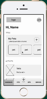
3. Sketch
Sketchs
Wireframes
4. Working on the details
Functional prototype
User flow
5. Test
User test
Flow validation
6. UI
Visual concept
Design system
Components library Interactive prototype
Final test and corrections
UNDERSTAND THE PROBLEM
Simplify User Experience
Create a Dashboard with Hyperlinks:
-
Implement a clean and organized dashboard featuring hyperlinks for seamless navigation.
-
Utilize a tab bar for quick access to essential features, ensuring an intuitive user interface.
Prioritize Features
Dashboard Card:
-
Introduce a dedicated card on the dashboard for quick and intuitive access to vet records.
-
Enhance visibility by adding a specific item to the tab bar, streamlining the request process.
Focus on New Users
Highlight Main Features:
-
Tailor the initial dashboard experience for new users by prominently featuring main features.
-
Add a personalized card to guide new users through the platform's key functionalities, ensuring a smooth onboarding process.

Information archteture
A pivotal consideration was understanding the user mindset. Features like Records, integral to both Pet and Vet interactions, posed a dilemma. Deliberation ensued on whether to include such features on the Pets page, Vet page, or both—a decision anchored in enhancing user experience and logical grouping.
The challenge lay in consolidating similar sections and deciding where each feature should reside. The goal was to streamline the site map to just 4 or 5 pages, mitigating complexity while ensuring ease of navigation.
A pivotal consideration was understanding the user mindset. Features like Records, integral to both Pet and Vet interactions, posed a dilemma. Deliberation ensued on whether to include such features on the Pets page, Vet page, or both—a decision anchored in enhancing user experience and logical grouping.
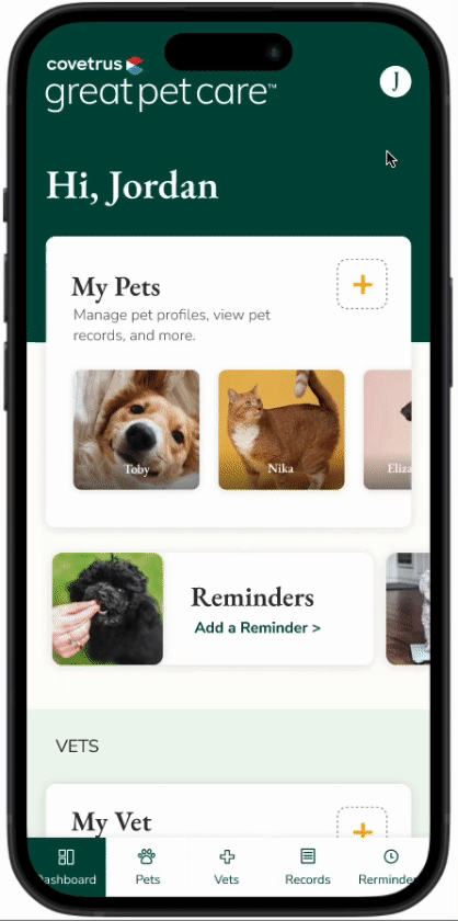
Dashboard
-
View a personalized dashboard with quick links to key features.
-
Access comprehensive medical records, including vaccination history.
-
Request new records and manage existing ones.
-
Share or send records seamlessly.
-
Explore Over-the-Counter (OTC) Shopping, with Version 1 acting as a promotion or link to Great Pet Shop.
My pets
-
Manage reminders, including manual and automated options.
-
Customize reminders as needed, with the ability to toggle them on or off.
My documentation
-
Access a consolidated list of booked appointments.
-
Review and manage wellness plans.
-
Keep track of telemedicine and teletriage consultations.
-
Manage prescriptions and access a comprehensive list of medical records.
Profile
-
View and edit profile information.
-
Access a communication center for seamless interactions.
-
Change password or sign out for security and convenience.
SITE MAP

The structure model chosen is hierarchical, which is a top-down structure starting from the homepage, with links to main pages with more pieces of information. The creation/requests flows are in sequential mode, which leads users through a step-by-step process.
WIREFRAMES - The End of Honeymoon:
Despite an in-depth examination of references, uncertainties persisted regarding the optimal design approach. To address these, multiple brainstorming sessions were conducted. It was agreed that testing various options, particularly after incorporating UI elements, would provide clarity.
Key Decisions
User Presentation
The primary focus was on determining the best way to present information to users effectively.
Dashboard content
Extensive deliberation centered around defining the content to showcase on the dashboard for optimal user engagement.
Section integration
The question of whether to combine certain sections or keep them separate was a key decision point. Balancing user accessibility and content organization played a crucial role.
Form presentation
The decision on whether to present forms as a single screen or break them into multiple steps was a critical consideration. This choice aimed to enhance user experience and streamline interactions.
UI
In crafting the initial version of the UI, a deliberate decision was made to align with the established Great Pet Care colors and brand. This strategic choice serves multiple purposes:
Brand Consistency
Retaining the Great Pet Care color scheme and fonts ensures a consistent and unified brand identity. This not only fosters brand recognition but also reinforces the connection between the new version and the broader Great Pet Care ecosystem.
User Familiarity
For existing users, the continuity of familiar colors and fonts facilitates a smooth transition. This approach minimizes disruption and allows users to navigate the updated platform seamlessly, enhancing overall user experience.
Efficiency in Implementation
Leveraging the existing Great Pet Care color palette and fonts streamlines the implementation process. It reduces the need for extensive design adjustments, enabling a more efficient rollout of the first version.
TESTS
Main comparations
Navbar vs. Hamburger Menu
Evaluating the effectiveness of the navigation system, comparing a traditional Navbar against a Hamburger Menu to determine the optimal layout for user engagement.
Creating Flow (Step-by-Step) vs. All Form in One Screen
Assessing the user experience by comparing a step-by-step creating flow with presenting all form elements on a single screen. This comparison aims to identify the preferred approach for user comprehension and ease of interaction.
.png)
Software Used
The design and testing processes were facilitated using Figma for prototyping and Word for documentation.
Rate System
Users were asked to rate their experience using a 1 to 5 scale:
1: Super easy and enjoyable!
2: Somewhat easy, maybe took me a second to find something.
3: Somewhere in the middle, wasn’t easy but I completed the task.
4: Difficult, but I could complete the task with much effort.
5: Not able to complete the task.
User Testing Details
A total of 6 users were engaged in the testing process, providing diverse perspectives on the usability and functionality of the platform
Final scores
Save vet
Score 1,5
Request record
Score 1,5
Find record
Score 1,5
Add reminder
Score 1,4
Add pet
Score 1,0
Recognizing the impact of user backgrounds on test results, we incorporated initial questions in the interviews to better understand users' contexts. This practice aimed to shed light on potential variations in user responses, particularly in instances where conflicting answers surfaced.
.png)
Initial questions
-
How many pets do you have?
-
What kind of pets?
-
How old are your pets?
-
How frequently do you visit your vet?
-
Do you use any pet specific apps or websites for pet parenting (buy food, telemedicine, wellness, etc.)? Please list them here:
-
Please list some of your favorite non-pet websites or apps you use frequently:
-
Do you have an existing Great Pet account (Be honest, we have data)?
-
If you answered “yes” and you have a Great Pet account, how have you used it so far?
Test's tasks
-
Add pet
-
Find and save your pet's vet clinic
-
Request a pet record
-
Find your medical record
-
Add a reminder
Final Considerations
Testing Efficiency
Recognizing prototyper errors, the decision to break the test into parts aimed to enhance the efficiency of testing in Figma
User Accessibility
Users could access and successfully complete tasks without encountering significant issues. This underscores the platform's user-friendly design.
User Feedback
Valuable user suggestions were received, particularly regarding additional features and new titles for sections. This user-driven feedback provides insights for future enhancements.
Favorite Feature
The reminder feature emerged as a user favorite, demonstrating its significance in user engagement. Users expressed a desire to expand on reminder types, indicating potential areas for feature refinement and expansion.
Continuous Improvement
User feedback serves as a foundation for continuous improvement. Incorporating user suggestions into future iterations will contribute to a more refined and user-centric pet management platform.
BRAND VOICE

BEFORE
This veterinarian is not currently using a Covetrus pharmacy storefront. To purchase this medication, contact them directly or check price on 1-800-Pet-Meds.
AFTER
This veterinarian is not currently using a Covetrus pharmacy storefront. Contact them directly or check price on 1-800-Pet-Meds.

DESIGN SYSTEM
In this section, you will see part of the design system to understand how we organize the documentation.
COLORS
The goal of this doc is to show all color possibilities and some practical examples, in each type of component's document (buttons, fields, etc), you can find color specifications included too.
Additionally, you can find tags, close to the color, indicating how to use it.


PRINCIPLES
1.
The colors indicate which elements are interactive, how they relate to other parts and their level of prominence. The main elements should stand out the most.
2.
Text and icons should meet legibility standards when appearing on colored backgrounds. Preferably AA+
3.
Show brand colors at memorable moments that reinforce your brand’s style.


ICONS
1.
Focus on simplicity to help merchants understand the concept the icon represents and recognize icons on smaller screens.
2.
Literal symbols are easier to understand than abstract symbols. When possible, use symbols that represent the most basic idea or concept instead of a metaphorical one.
3.
Prioritize representing the function, rather than how nice it looks.
System icons are designed to be simple, modern, friendly, and sometimes quirky. Use outline icons instead of filled icons.

FONTS
1.
Keep related text aligned and closer together to create visual groupings. For most languages, the majority of text should be left-aligned.
2.
Pair font weight, size, and color together to create hierarchy. Use a lighter color or font-size to de-emphasize secondary content.

Want to see more design system details?
This proposal has been the version one focus.
Today you can access the site and take a look at the latest versions.
.png)

Great Pet Care is an Oowlish client. This project is also part of Oowlish and my workmates' portfolio.
